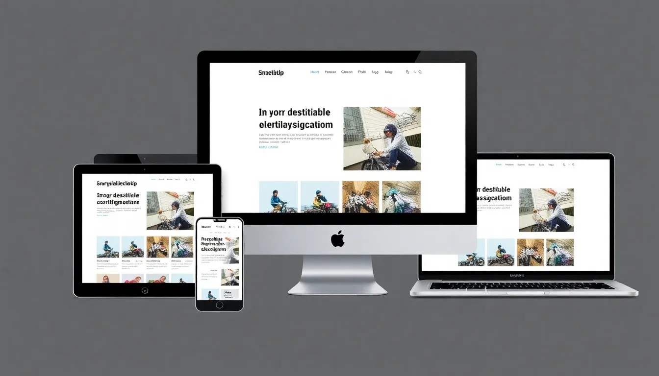
Responsive web design is no longer optional - it's essential. With users accessing websites from an ever-growing variety of devices and screen sizes, creating layouts that adapt seamlessly to any viewport is crucial for success.
The Foundation: Mobile-First Approach
The mobile-first approach means designing for mobile devices first, then progressively enhancing the experience for larger screens. This methodology ensures that your core content and functionality work on all devices.
Understanding Breakpoints
Breakpoints are the points at which your website's layout changes to accommodate different screen sizes. Rather than targeting specific devices, focus on your content and let it determine where breakpoints should occur.
Fluid Grids and Flexible Images
Responsive design relies on fluid grids that use relative units like percentages instead of fixed pixels. Similarly, images should be flexible, scaling within their containers to prevent overflow.
Media Queries
Media queries allow you to apply different styles based on device characteristics, primarily screen width. Start with your mobile styles as the base, then use min-width media queries to progressively enhance for larger screens.
Performance Optimization
Responsive design must be paired with performance optimization. Mobile users often have slower connections, making fast load times critical for user experience and SEO.
Conclusion
Responsive web design is about creating flexible, user-focused experiences that work everywhere. By following these best practices, you'll create websites that delight users on any device.
Back to Blog